Super Rugby 2025
-
The logo on the back is a new thing isn't it?
https://shop.nzsuperrugbyclubs.co.nz/products/chiefs-mens-25-pro-training-tee
-
I personally find the Scottish thing a bit silly, but I'm not from there. The Southern lights feels much more NZ to me and those designs actually set the jersey apart. I don't usually buy merch for other teams, but that is neat.
@gt12 agreed, i think the scottish thing COULD be ok but you need to actually commit and have a design language with tartan and stuff...but the aurora is a bit different, think i even saw the Forsyth Barr roof lit up like the aurora which is cool
-
The logo on the back is a new thing isn't it?
https://shop.nzsuperrugbyclubs.co.nz/products/chiefs-mens-25-pro-training-tee
-
The logo on the back is a new thing isn't it?
https://shop.nzsuperrugbyclubs.co.nz/products/chiefs-mens-25-pro-training-tee
@Bovidae said in Super Rugby 2025:
The logo on the back is a new thing isn't it?
https://shop.nzsuperrugbyclubs.co.nz/products/chiefs-mens-25-pro-training-tee
That's a sweet design - bit of a throwback to some of their 90s playing jerseys.
-
@gt12 agreed, even if people dont like it inherently of abjectly...you have to like the fact its something different, Ive felt for a while our highlander/scottish stuff is a little played out...or not played enough. I think its either time to either identify something like this as a point of difference (ie always have bands of these colours around the cuffs of under the arms)....or we need to actually have panels if tartan.....plane blue jerseys is so boring
@Kiwiwomble said in Super Rugby 2025:
@gt12 agreed, even if people dont like it inherently of abjectly...you have to like the fact its something different, Ive felt for a while our highlander/scottish stuff is a little played out...or not played enough. I think its either time to either identify something like this as a point of difference (ie always have bands of these colours around the cuffs of under the arms)....or we need to actually have panels if tartan.....plane blue jerseys is so boring
My expectation would be that the next jersey has more of an explosion or colour.
From 2012 onwards Landers jersies were always very Minimalist with two tones of blue. From 2014-2019 there was a Scottish design, 2020-23 were a bit different - nice but boring.
IMO, the first classic jersies were probably rushed and they can learn from the reception of the retro jersies
-
@Bones said in Super Rugby 2025:
People have an issue with a team called the highlanders using a Scottish design? Huh
i dont think thats what i meant, more just we kind of half arse it now days so either we lean in more like the chiefs do....or we lean into something different like the aurora...at the moment our defining feature is...blue...like half the other teams int he comp
@frugby said in Super Rugby 2025:
From 2012 onwards Landers jersies were always very Minimalist with two tones of blue. From 2014-2019 there was
what scottish design did we have? the kind of watermark? i dont really consider that as its invisible...they also often look like stock image BS
like this swords and shield

do we really think this random check pattern is scottish?

or these bar codes?
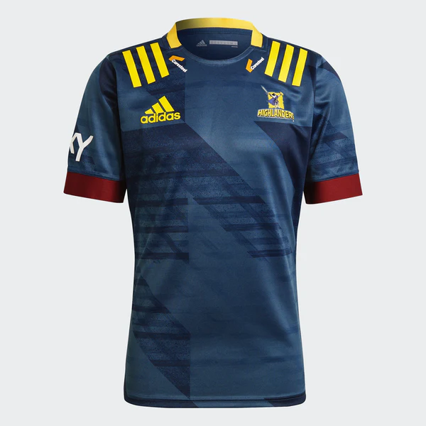

compared to the chiefs who often have a Māori artist design them something custom
-
@Bones said in Super Rugby 2025:
People have an issue with a team called the highlanders using a Scottish design? Huh
i dont think thats what i meant, more just we kind of half arse it now days so either we lean in more like the chiefs do....or we lean into something different like the aurora...at the moment our defining feature is...blue...like half the other teams int he comp
@frugby said in Super Rugby 2025:
From 2012 onwards Landers jersies were always very Minimalist with two tones of blue. From 2014-2019 there was
what scottish design did we have? the kind of watermark? i dont really consider that as its invisible...they also often look like stock image BS
like this swords and shield
do we really think this random check pattern is scottish?
or these bar codes?
compared to the chiefs who often have a Māori artist design them something custom
@Kiwiwomble said in Super Rugby 2025:
@Bones said in Super Rugby 2025:
People have an issue with a team called the highlanders using a Scottish design? Huh
i dont think thats what i meant, more just we kind of half arse it now days so either we lean in more like the chiefs do....or we lean into something different like the aurora...at the moment our defining feature is...blue...like half the other teams int he comp
@frugby said in Super Rugby 2025:
From 2012 onwards Landers jersies were always very Minimalist with two tones of blue. From 2014-2019 there was
what scottish design did we have? the kind of watermark? i dont really consider that as its invisible...they also often look like stock image BS
like this swords and shield
do we really think this random check pattern is scottish?
or these bar codes?
compared to the chiefs who often have a Māori artist design them something custom
Those last two from 2020-2023 I believe were not meant to be Scottish singularly. The 2020-2021 one made out a Scottish pattern for the whole forward pack though from memory? As I said again, the Scottish designs were minimalist in a two tone blue, so hard to see.
-
@frugby might have to move to the highlanders thread or the kit thread
thats probably the best but still just a faint pattern thats more or less invisible and reasonably generic
@Kiwiwomble said in Super Rugby 2025:
@frugby might have to move to the highlanders thread or the kit thread
thats probably the best but still just a faint pattern thats more or less invisible and reasonably generic
Probably! I personally would like to see more colour.

I honestly think the retro design should be the basis. The gold works better as a secondary colour than the maroon IMO, but could they try a really bold chequered pattern all over?
-
@Kiwiwomble said in Super Rugby 2025:
@frugby might have to move to the highlanders thread or the kit thread
thats probably the best but still just a faint pattern thats more or less invisible and reasonably generic
Probably! I personally would like to see more colour.
I honestly think the retro design should be the basis. The gold works better as a secondary colour than the maroon IMO, but could they try a really bold chequered pattern all over?
@frugby ive made the comment before the gold/yellow is the common colour between north otago, otago and southland so should be more prominent
id take the pseudo tartan pattern and always find a spot for it, just a detail around the cuff/collar/hem for example
-
Tahs Home:

Tahs Away - sexy:

But probably my favourite - their "run out" tee or warmup gear I suppose you'd call it.

@NTA those are pretty sick and the Reds one has some strong throw back vibes
those are classic designs, surprised the waratah logo is blue...its normally red isn;t it?
thats how you do a collar without the huge floppy ones we got on our retro jerseys or the current ABs one
-
Good to see more effort in the kit design.
And I know it's sad for the Melbourne supporters, but the Aussie squads look more competitive this year - especially the two big markets.
-
Good to see more effort in the kit design.
And I know it's sad for the Melbourne supporters, but the Aussie squads look more competitive this year - especially the two big markets.
@antipodean Tahs apparently lost Fergus Lee-Warner for the season - a foot injury in Japan supposedly.
Second row looks a little thin on that basis.
-
Have always love the tahs and brumbies kits. Especially the brumbies
-
The Brumbies have found a veteran powerhouse to bolster their front-row stocks in the form of Tongan international prop Feao Fotuaika.
The 31-year-old has landed in Canberra following two and a half years and 28 games with Lyon in the Top 14. The six-time ‘Ikale Tahi prop has previously played for the Reds.

